Saakshi Dixit
Case study · B2B SAAS · AI CODING ASSISTANT
Building a vibe coder with backend capabilities
AI Native
Web
0–1
Weekly Cycle
Role
Associate Product Designer
Timeline
0→1, ~3 months to launch
Tools
Figma, Figma Make, PostHog
Team
me+ 1 senior designer
The team collaborated directly with the founder, engineering team and marketing team
I led product design for an AI coding assistant that lets non-technical builders ship real backend logic — not just frontend UI. In the first two months post-launch, it hit $150K ARR and reached #1 Product of the Day on Product Hunt. My core bet: trust in an autonomous agent comes from transparency, not automation — the builder always needed to see what the system was doing and why.
$150K ARR
within 2 months of public release
#1
Product of the Day, Product Hunt launch
3 mo
from pivot to shipped product
Background
How can we be different than any vibecoder in the market?
Most AI coding tools stopped at the frontend — builders could prompt their way to a nice UI, but anything requiring real backend logic (auth, data models, integrations) meant handing off to an engineer or hitting a wall.
Our team saw an opening to let non-technical founders build backend-capable products end to end, competing directly against the frontend-only wave of vibecoding tools.
Before
After

Problem
Users could prompt. The LLM could code. But then what?
Builders could prompt the LLM to write code, but had no way to know if it was doing the right thing. Early testers would let a build run, come back, and have no idea whether it had actually finished, silently failed, or made an assumption they'd have disagreed with. Trust broke down fast: several testers described reviewing every single change line by line, which defeated the point of an AI builder.
Agentic flows felt like
black boxes
Error states
left builders confused
No visibility into what the system
was doing
Backend complexity
bled into the UI
Approach
The agent had to feel like it understood the user, which meant transparency at every step — not more automation, but more visibility into what the automation was doing.
Approach #1
It wasn't screens but business
We were building fast to launch fast, so feedback couldn't wait for a survey. We watched Posthog recordings and sat in live Discord threads. Post-standup, I'd pick the week's priority straight from that and own it end-to-end until it shipped.
Approach #2
I vibecoded a vibecoder
Before writing a single spec, I built a working vibe coder in Figma Make just to feel the flow myself then pressure-tested it against Bolt, Cursor, and Lovable to see where ours actually needed to diverge.
Approach #3
Designed incorporating live-time feedback
With no handed specs to execute — we sat as a thought partner on the business calls, so every screen I designed was already weighing the business tradeoff, not just the UI one.
Approach #4
A weekly product cycle
Monday standup to Friday ship, every week — we'd pick the priority, I'd own it end-to-end, and by Friday it was live enough to get real user feedback before the next
cycle started.
Solutioning
Solving for one Problem at a time
Prioritising workflows with maximum impact and minimal effort.
It helped secure fast market validation, generate early momentum, and derisk our core value proposition before scaling.
Solving for black boxes & Visibility
The agent had to feel like it understood the user...
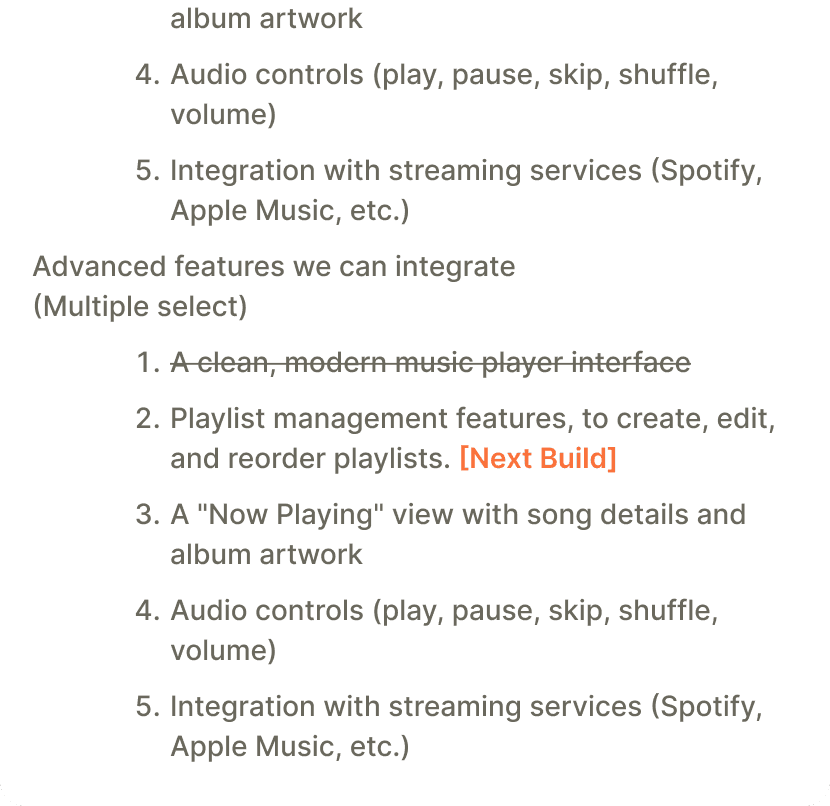
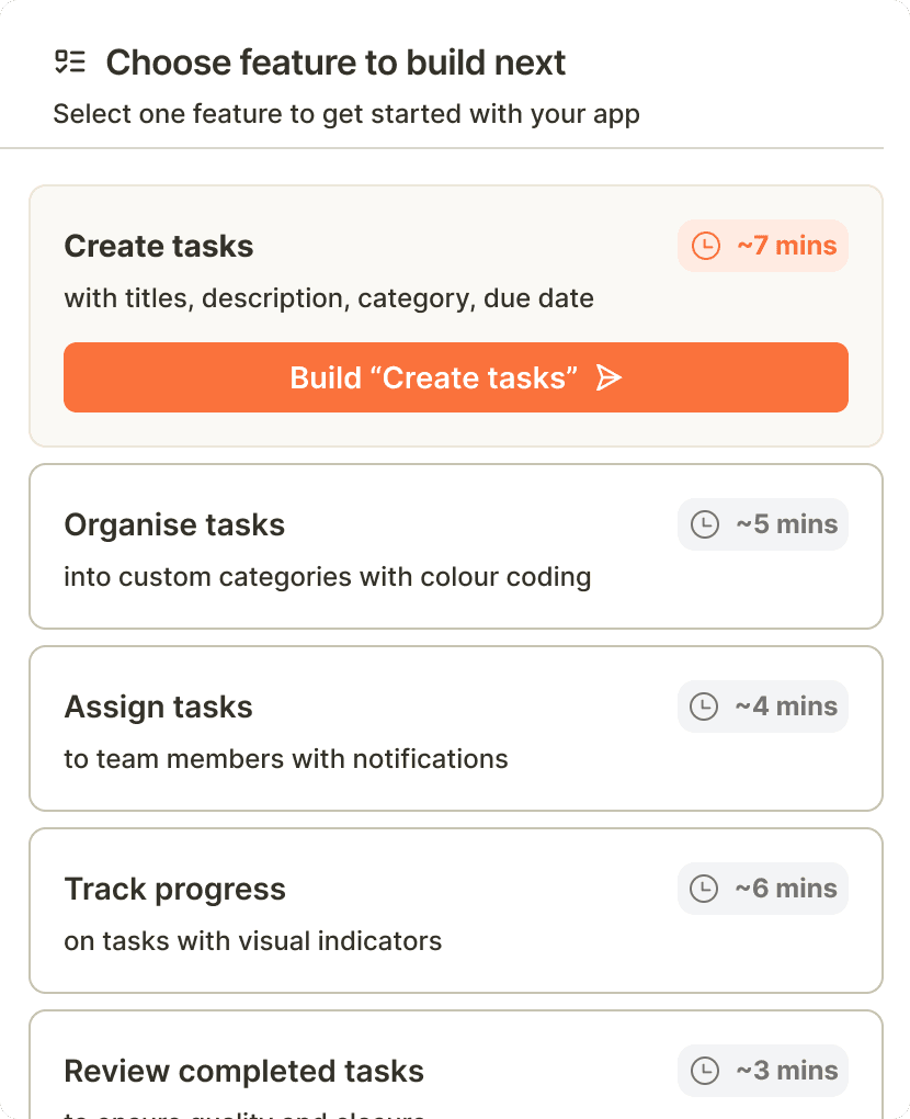
Builders needed to know what was being built right now, what was next in queue, and whether anything extra was happening in the background. I solved this by breaking every task into smaller, visible steps — and letting builders choose what came next instead of the agent deciding for them.
Before
After
A build bar that shows the agent thinking, not just working
Builders needed to see the agent thinking, not just wait for output. I designed the build bar to show live status, time taken, and next action in one glance.
Letting builders pick what gets built next instead of
everything at once
Builders assumed handing over a prompt meant losing control of the whole build. I broke the roadmap into a queue builders could reorder or select from, so they chose what shipped next instead of the agent deciding for them.
Showing estimated time left, not just "in progress"
An indefinite spinner made builders assume the system had stalled. I added time estimates based on task type, so waiting had a visible end point.

Solving for error states
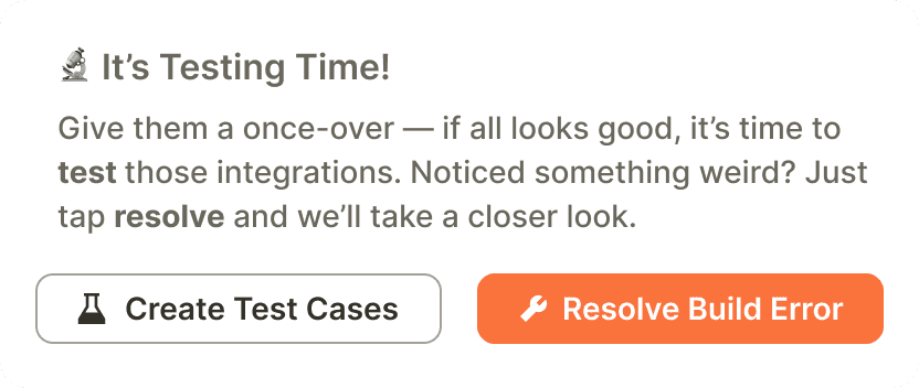
Verifying a build actually worked instead of assuming it did
A build finishing didn't mean it worked builders only found out something was broken once they hit it live. I added a test-case checklist that ran right after build completion, so failures surfaced before builders trusted the result.
Distinguishing "you need to act" errors from
"we're handling it" errors
Every error looked equally urgent, so builders panicked over things the system was already fixing. I split error states into two visual tiers based on whether action was actually required.

Solving for backend capabilities
Auto-detecting integration needs instead of asking builders
to configure them
Builders didn't know which integrations their app even needed. I had the system detect required services from the build itself and pre-fill the setup, so builders confirmed instead of configured.
Explaining env vars in product terms, not infra terms
"Set your environment variable" meant nothing to non-technical builders. I relabeled each field by what it actually controlled in their app, hiding the technical name behind it.
I helped enable flow to deploy with integrations
Wiring in Composio was straightforward for us — the hard part was figuring out how someone with no coding background would know what to do with it. We solved it by breaking setup into small, guided steps, so builders never faced more than one decision at a time.

Solving for small wins
I designed for accessibility (WCAG)
I mapped the onboarding journey against WCAG requirements, clarifying decision points and breaking compliance-heavy steps into smaller, progressive stages.
Showing multiple data points around the prompt box
I created multiple iterations around chatbox in the interface to make the user aware of all the datapoints specific to the experience. The chatbox needed to depict
State of the agentic builder
Build time taken
Access to Settings
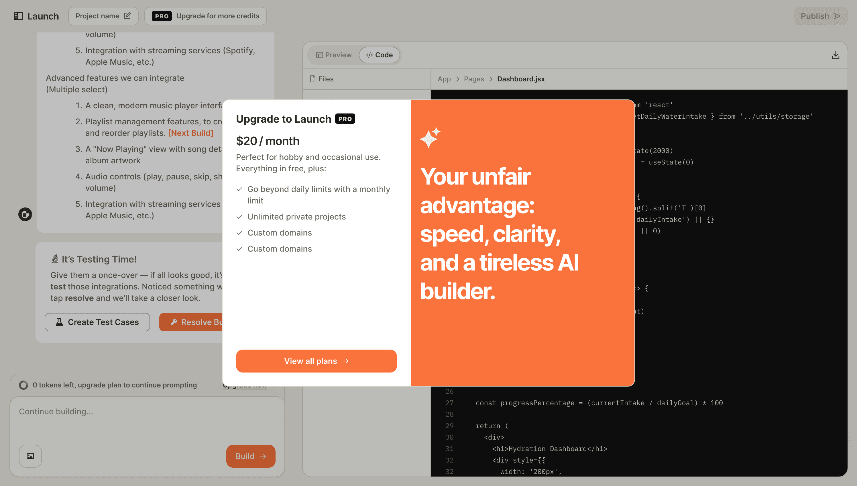
CTA to upgrade plan
Start build
Prompt bo

This iteration was chosen because the hierarchy felt more harmonious, Upgrade plan was anyway the global CTA. To gain users attention we could bring it out as a toast for when the users ran out of credits for extra attention.
At this stage I added the option to add images for reference and specific image requests
on the app.

We wrote for co-creation, not automation
Never AI doing it all unprompted, never the user left to do it alone. Trust was built one micro-interaction at a time. The UX was to be tailored that way

Outcome
Hit $150K ARR within 2 months of public release
A simpler onboarding foundation carried the first wave of B2B customers and gave the team a pattern that scaled to future business flows.
Ranked #1 on Product Hunt on launch day
We hit #1 on product hunt
The product shut down 3 months post-pivot
The product shut down 3 months post-launch — distribution outpaced design as the constraint in a crowded market. It taught me to weigh go-to-market risk earlier in the design process, not just after ship.
This project is under NDA. So the elements are modified.
Feel free to get in touch to know more :)
© 2026